Tuesday, 17 March 2015

Using Ink and Paint

During this task I was told to create an image using images I already had, paint and ink. This is a form of physical manipulation to an image. I have chosen images from a previous fashion project.

 This is the first image that I used. I thought that I should start very basically with paint however I disliked the innitial result and decided to use my hands to blur the colours which revealed parts of the image. In particular the face of the model had become visable across the eyes and mouth. This makes the image spooky to look at because all the details are not visable; like something is being hidden from the veiwer. I think that this vould have been more effective with shades of black since as the image is already made to be quite eerie and the black could be interpretted as the aura the character is trying to display. It could also be taken as a protective shield just like the face paint that she is wearing.

The second attempt I decided that I would use black and white ink to drip onto the paper; however when this looked too boring I tipped the image to let the ink fall down the page. I think that the colour revearsal works a lot better because it seems to act like a veil which is adding to the eerie appearance of the image. The original image shows the model already wearing black and white face paint, this shows an advancement of the 'masks' depth in the image.

Using a different image I wanted to use the ink to make something like a picture card often used to evaluate phsycological sanity. However the different inks have really mixed together and not worked out how I had hoped. I feel that this method might slow my down and not create strong results so I go back to dripping the ink.

I feel that this image has potential to be stronger, although I would have to use a more viscous ink or paint like acrilic paint. The ink simply was too thin and ran down the page to fast for it to be absorbed. This image was to originally to show the fear that some people carry with them when they gamble and now it shows more of the result. this would be a following image to the original work I did to create this image.

Sunday, 8 March 2015

Karl Lagerfeld

Born 1933; Lagerfeld was the son of a wealthy German businessman. The wealth his farther had allowed him to study in Paris at the age of just 14 and become an artist as well as designer. Since his 30's he has been taking part in prestigious competitions and worked for many top designer brands like Chloe and Vogue. He also used his own fashion and style to produce his own label which he eventually sold but kept all design control of.


The model in this image is Abbey Lee, one of the most sort after models of the fashion industry. With recent work being completed for the likes of Hugo Boss and Gucci. To me this image feels like Lagerfeld is trying to make Lee look fragile and delicate. A lot like a china doll. Her bleach blond hair is decorated with an array of flowers and translucent materials. Gold has been used as the main jewellery material probably to match the hair and similar pale yellow tone of her skin. The reds and purples used for the lipstick also matches other areas of the image including the cloth she is wrapping herself in and dark tones of the eyeshadow used. 
I think that Lagerfeld has used two lights to create this image. It looks like a snoot was used on the light for the background due to the gradual fading in tone outwards from the centre of the dense area. I also think that he has used a form of flash ring that has created two clear lines down the face and their reflection is visible in the models eyes.
 
 
Lagerfeld has made his own fashion/style into a brand. He uses his name, face and distinct blacked out glasses as the label for his designs, many know who he is and his work because of the massive amount of unique branding. All of these images shows how he would normally dress: the sunglasses, white hair in a pony tail, high white collar, dark suit, jewellery on the tie or necklace and finally the gloves. Lagerfeld has also created extra areas on his website which publicises his lifestyle. Karlism is an area where himself or assistants would post sayings/quotes from him. There is also an area called The Karl Daily which to my understanding is a newspaper that is about Lagerfeld, his latest designs and stories that is of interest to him and his brand.
This might be something that I can think about, using repetitive imagery to communicate awareness of a style or brand, maybe even create a brand. I would then have to think about typography and what the brand would be. I would also have to consider what the continuous theme would be since as I wanted to experiment with different colours and styles.

Saturday, 7 March 2015

Martin Parr

Parr was born in England, 1952. His grandfather inspired him in his teens to take up photography and studied it in university. He has created a worldwide reputation with his social documentation. His images create a sense of humour because he creates images that reflect a strange reality that we can relate to and in essence put ourselves in the image. Travelling all around the world to photograph has allowed him to experience all different cultures and see how cultures have mixed together to create familiar situations. In 1994; Parr became a full member of Magnum Photos.

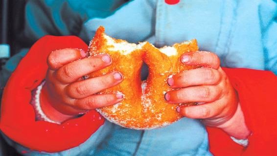
This image was taken in Ramsgate, England 1996 and it is called New British. Parr has used very saturated colours which make it very garish. The brightness is overpowering however he has used this to make the structure of the image. All the areas of red creates a triangle which places the main subject (the doughnut) in the middle of the image. The blue of the coat takes up a large portion of the background and contrasts the red; enhancing the garishness and definition. I think that this image combines natural light and superficial light from the camera. The shadow along the blue coat in the upper left corner indicates that there is intense light shining down from behind an object and onto the model. However this would create a lot of shadows behind the arms and create a larger contrast across the red. This is why I believe that a frontal flash has been used and balanced the shadow and intensified the exposure on the foreground. This image feels very familiar because when families go out to leisure locations like the beach you often see children eating junk food and getting it all over themselves. Often Parents photograph this moment because it is funny and a memory that they want to capture. Parr on the other hand has only taken a picture of the food which leaves the image of the mess to our imagination to think about and come up with.


This image was taken in United Arab Emirates, Dubai at the DIFC Gulf Art Fair, 2007. It looks like this image was taken in a gallery because of how clean the white walls are and the information plates to either side on the artwork. The model is centrally positioned in the frame admiring the work. Based on the clothing I would guess that he was a fan of the artists or another similar to them. All the lighting that has been used is superficial. A gallery would have very good safe lighting for the artwork so that the audience can view the artwork properly. This would have been positioned from above; this is supported by the shadow under the right arm. However I can also see a shadow behind the models hair suggesting that Parr has used flash from the camera again. This would explain the lack of contrast from ripples in the shirt and why the models hair looks like it it shining. The fact that the models clothing matches the art work it makes me feel like this is trying to show the living embodiment of the work. As if it has come to life and walked out of the painting. This image reminds me of positions where I have been at events and very enthusiastic fan have dressed up and stand out. I am sure that this character would have stood out amongst the crowd.

Luke Waller

Waller is a commercial illustrator in the editorial sector. Most of the time he works with pencil drawings and mono printing to put colour in his images however he will often use Photoshop if the deadline is very short and create a similar effect he would have using the physical method.

This illustration was commissioned by Highlife Magazine for the interview with Paloma Faith. The characters in the background are characters from the Wes's films. This is because during the interview she states that they were a massive influence to her work and sometimes inherit their personalities during her work. To me this image looks like it was made physically because of the very rough nature of the colour against the lines. This would match Wallers style of using monoprinting. A large variety of colours have been used, mostly cold colours like blues and greens; however a dark orange has been used which is a signature colour of Paloma's hair. This colour has then been used in other areas which enhances the importance it has to her character. I really love how the colours are so rough and raw compared to the detail that has been put into the portraits.There is also what looks like paint drippings along the bottom and left of the image which might have simply been done with a dropper and ink; this adds to how raw the image looks. I would like to learn how to use this style so that I can incorporate it into my own work.

This image is called the American dream and Waller states that it is all about how it has changed over time now that technology is so much more accessible. It also shows how we often see families on TV and social networks which has influenced how we behave and what we expect from a family. The blue tones on the flag and the family shows how cold and boring the dream has become. However the bright orange and yellows from the TV is covering up how boring it really is by making it look positive. The warm colours would make the viewer feel good about what they are watching which actually should all be a shade of blue. The warm colours is then transferred across to the family which is visible. This shows how influenced they are, it's a little like they are brainwashed.

Andy Warhol


To create this image Warhol and assistants used a silkscreen technique which is a method using screens, light sensitive emulsion and stencils to create multiple versions of the same artwork. This is often used in clothing mass production. Each of the faces also look different every time. Whether it's the colour of the paints or positioning of the models facial features like the eyebrows. In some of the images there is blur or movement. This may be a result of attempting to complete the job very quickly and slipping with the emulsion or stencil. However this seems to add character to this collection of images and makes each of them unique even though they are all meant to be the same. Each of them being slightly different makes me think that they are individual images, all taken in quick succession similar to a film strip. A lot of the detail in the images have been taken away because of the technique used to make it. However there is enough detail to recognise the famous figure who is modelling. The colours that have been used are very bright and grabs the attention of the viewer. They seem to exaggerated the actual colours of the models face and hair, since as we know Marilyn Monroe is Caucasian and blond.

Once again Warhol has used an image repetitively of an item that is seen in supermarkets across the USA. Everyone would have seen this tin and Warhol has made it into a piece of art by making it the main subject. However there are lots of copies of these being displayed in the gallery giving it the effect that you are actually looking at a shelf in the market. A large amount of the image is either black or white and the colour red is what makes this image stand out. The tin is central inside the frame and covers the frame from top to bottom. I really like this image because of its uniformity and simplicity of the colours and shapes that have been used. All of them are actually quite different because they are all different flavour soups; one even has a gold ribbon across the middle.

Friday, 6 March 2015

Health and Safety

COSHH 2002 regulation is the identification and understanding of the use of chemicals in a workplace or environment. COSHH makes employers consider the risks of the chemicals, consider safety measures that will be taken, enforce training to use the chemicals and plan for emergencies as a result of exposure. This will make sure that chemicals can be used safely and no one will get harmed.

Display screen equipment 1992 is the regulation involving people who work with graphic display screens including tablets, computers and phones. Working with screens is often related with eye strain, arm, back and neck ache. This regulation gives employers ideas on how to use them properly with positioning of the seat and time periods of usage.

The main requirement of the Health & Safety act 1974 is to conduct a risk assessment. This will identify all the risks in the workplace and give the employers a cause for action or prevention of potential accidents. This could be completed with protective clothing, training and recording of accidents so that they can be reviewed by management.

Caravan gallery task

I am going to look at the Caravan Gallery postcards. It is a collaboration between two practitioners Jan Williams and Chris Teasdale. They have traveled the country with their caravan that they use as a gallery and shop to sell postcards. Their images are very provocative because they dont exactly focus on the good parts of the subject. they are usually very grungy and somewhat dirty because of some of the compositions and subjects.

I have been given the task to create a postcard in a similar style to theirs regarding the layouts and the subjects.


All of these postcards have very similar template. They all use a block colour for the background and use bold white text. The images have a border between them, however they are pushed to the edge of the card. Between 4 and 6 images have been used. The card is then separated every time straight through the middle. The images used are very classical to the location, very stereotypical. It makes the location look very cliche. They have also used very saturated colours which reminds me of work by Martin Parr. Colours used as the background is also highlighted in the images with saturation to make the images stand out.


I think I am going to use all the circled images for my postcard because it is in the recommended number of images. 

The first thing I did was make the template at 148x105mm which is the size of a postcard. I then turned it red since as there are red areas in all the images I have chosen. I then saturated the images separate to the template with crops, then I flattened the image and transfered them over to the template. Positioned them up with guides so that it matched the examples and added another layer for the text which I made white.